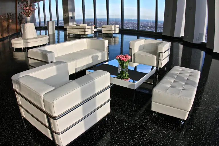
Furniture Rentals

Why Event Furniture Color Choices Matter More Than You Think

June 3, 2026 By Event Fab Team 9 min read

Furniture color is the part of an event design that most teams under-think and then spend the cocktail hour trying to fix in camera. The wrong sofa fabric turns your brand blue gray under tungsten wash. The wrong bar finish flares out under the photographer’s flash. The wrong accent chair ends up cropped out of every share because it clashed with the step-and-repeat. None of that is a furniture problem in isolation — it’s a color decision that wasn’t made on purpose.

This guide is for brand and agency teams choosing rental furniture for activations, galas, conferences, and pop-ups across NY, CT, MA, and RI. We’ll walk through how color theory actually plays out under event lighting, how to align furniture palettes to your brand guidelines without going matchy-matchy, and how to spec pieces that photograph well — because content is half the reason you’re producing the event in the first place.
Key Takeaways

  • Furniture color reads differently under tungsten, LED, and daylight — always color-check the actual rental piece under your venue's house lighting before lock-in.
  • Brand alignment isn't logo matching. Pull two accent colors from your guidelines and let neutrals (bone, charcoal, walnut) carry the room.
  • High-saturation upholstery photographs hot under flash — desaturated jewel tones and matte finishes are the workhorses for press and content capture.
  • Reflective furniture (mirror, acrylic, LED) needs a lighting plot designed around it — otherwise you get hotspots and washed-out faces in the photos.
  • Lock furniture palette decisions 6–8 weeks before load-in. Custom upholstery or wraps run longer, and rush color swaps eat margin.

Color Theory, Translated for Event Production

The basics of color theory don’t change because you’re producing an event — but the constraints do. You’re not designing a print ad you can color-correct. You’re staging a physical space that will be lit, photographed, and walked through by 400 people in three hours. A few principles matter more than the rest:

Hue, value, and saturation each do different work

Hue is the color itself — red, blue, green. Value is how light or dark it is. Saturation is how intense or muted it is. In event spaces, value tends to do the heaviest lifting. A dark walnut bench and a bone linen sofa can sit next to each other in any brand palette because their values create the contrast — the hues are almost beside the point.

The 60-30-10 rule isn’t just for interiors

Roughly 60% of your visible furniture footprint should be a neutral or anchor tone, 30% a secondary, and 10% an accent color that ties to your brand. When teams flip those ratios — say, 60% magenta sofas because the brand is magenta — the room reads as a showroom for the color, not as a hosted event. The brand still lands, but the space stops feeling habitable.

Warm vs cool: the room is already biased

Most NYC industrial venues skew cool (concrete, steel, exposed duct). Most hotel ballrooms in Boston and Providence skew warm (carpet, drapery, tungsten cans). Your furniture palette either fights the venue or works with it. Fighting it is expensive — you end up gelling every fixture and still losing the battle on camera.

Brand Alignment Without the Matchy-Matchy Trap

The most common mistake we see from in-house brand teams is treating furniture color like a Pantone match exercise. The guidelines say the brand red is PMS 186, so every sofa, ottoman, and bar stool ends up PMS 186, and the room looks like a trade show booth from 2009.

Strong brand-aligned event design works the other way. Pull two colors from your guidelines — usually a primary and one supporting accent — and let neutral furniture do most of the room. Then deploy the brand colors as accent pieces, lighting washes, and graphic elements where they punch hardest:

  • Accent chairs and ottomans — small footprint, high visual impact, easy to swap if the photographer asks for a different hero shot.
  • Bar fronts and registration desks — these are the pieces guests interact with first and photograph against. Color them on-brand.
  • Custom-wrapped tabletops — a vinyl wrap on a rectangular cocktail table costs a fraction of upholstering an entire lounge and updates per event.
  • Pillows, throws, and styling layer — the cheapest swap, the fastest lead time, and often the only thing the camera catches.

For deeper background on how rental furniture programs are usually scoped, our breakdown of furniture rental benefits walks through inventory depth, sustainability, and budget tradeoffs.

How Color Reads Under Event Lighting (And Why Your Swatches Lie)

Here’s the part most brand teams discover at load-in, when it’s too late. The upholstery swatch you approved under office daylight does not look the same under the venue’s tungsten ambient or the production team’s RGB LED wash. Color appears different depending on the light source — that’s called metamerism, and it’s the reason a sofa that read camel in your studio reads green under the venue uplighting.

Rule of thumb for our production team:

  • Tungsten and incandescent venue lighting (2700–3000K) warms everything. Pinks turn salmon, whites turn cream, blues turn muddy. Choose furniture that already leans cool to compensate.
  • Cool LED architectural lighting (4000K+) drains warmth. Reds turn brick, oranges turn brown, browns turn gray. Warm-toned furniture survives better.
  • Programmed RGB wash (production lighting) will tint everything it touches. Neutral furniture becomes your friend because you can wash it any color you want from cue to cue.

This is exactly why LED furniture rentals have become so popular for activations — the piece itself is the light source, so it stays on-brand color regardless of what the venue’s overhead fixtures are doing. For a white-on-white minimalist aesthetic that still reflects whatever color you throw at it, mirror furniture rentals are a workhorse — they pick up your programmed lighting cues without needing to be repainted between events.

Designing for the Camera, Not Just the Room

If you’re spending six figures on an activation, half of the ROI lives in what the photographer captures and what guests share to their feeds. Furniture color directly shapes both, and the math is different from designing for the eye.

What the camera does to your palette

Camera sensors compress saturation and crush dark values. A fully saturated cobalt sofa that looks rich in person photographs as a flat blue blob with no texture. A matte charcoal sectional with a slight warmth holds detail beautifully on camera and in low light.

The flash problem

Press photographers and event photographers shoot with on-camera flash more often than they admit. Flash flattens highly reflective surfaces — glossy acrylic, polished mirror, lacquered finishes — into white hotspots. If your shareable hero shot is the lounge area, spec matte upholstery and brushed finishes for the seating itself. Save the high-shine surfaces for the bar back, the entrance, the moment when the gloss is the point.

The background test

Before approving any lounge layout, pull up your step-and-repeat artwork or your stage backdrop and put your furniture swatches against it. If the colors fight, the social photos will fight. Often the fix is small — switch the orange ottoman to a burnt sienna so it doesn’t vibrate against the magenta backdrop — but it has to happen before fabrication starts.

Lead Times, Custom Options, and What Breaks the Timeline

Color decisions cascade into production timelines faster than most brand teams expect. Here’s the realistic schedule we work backward from for a mid-size brand activation in the Northeast:

  • 8 weeks out — palette and furniture footprint locked. This is when custom upholstery, vinyl wraps, or painted finishes need to be greenlit if the rental inventory doesn’t have your color stock.
  • 6 weeks out — fabric and finish samples shipped to the client for approval under their office lighting AND under venue lighting (we’ll often arrange a site visit specifically to check this).
  • 4 weeks out — final color sign-off. After this, swaps run into premium charges, expedited shipping, or simply aren’t possible.
  • 2 weeks out — accessory and styling layer locked (pillows, throws, florals, tabletop). This is the last realistic moment to shift the palette without compounding costs.
  • Load-in — too late to change colors. The only fix is lighting, and lighting can only do so much.

What breaks this timeline: late brand-team approvals, last-minute sponsor add-ons with their own brand colors, and the classic move where someone in marketing sees the load-in photos and asks for the sofas to be ‘a little warmer.’ Build a 5-business-day buffer into every approval window and the timeline holds.

For the full furniture catalog and how rentals integrate with the rest of the production scope, see our event rentals service overview.

A Quick Field Guide: Color Choices by Event Type

Different formats reward different palettes. Some quick rules of thumb from producing across the Northeast:

  • Corporate galas (Boston Convention Center, Cipriani Wall Street, Rosecliff in Newport) — neutral anchor with one jewel-tone accent. Champagne, bone, deep walnut. Avoid black-on-black; it eats the room in photos.
  • Brand activations in DUMBO or Williamsburg warehouses — lean into the venue. Concrete and steel pair best with warm leather, brass accents, and saturated upholstery as the accent. The venue is already cool-toned; warm furniture gives it heart.
  • Tech and product launches — high-contrast, low-saturation. Matte white, light gray, and one brand color used sparingly. The product needs to be the hero, not the furniture.
  • Outdoor activations (Boston Seaport, Stamford Harbor, Newport summer season) — daylight is honest. Saturated colors work better here than indoors because the sun gives you the contrast you’d otherwise have to engineer. Just plan for fade-resistant fabrics.
  • Holiday and seasonal (year-end client parties) — let one seasonal color carry, then go neutral on everything else. Forest green velvet sofas with bone everything around them; not green sofas, red chairs, and gold tables fighting each other.

Color is the cheapest design decision to make right and the most expensive to fix on load-in day.

Event Fab Team

Serving NY, CT, MA & RI

Our furniture inventory ships to events across New York City, the Hudson Valley, Connecticut, Boston and the Massachusetts coast, and Newport and Providence in Rhode Island. We hold color samples for every upholstered piece in our shop so brand teams can match against their guidelines before fabrication or wrap work starts.

Building a Furniture Palette for Your Next Event?

Send us your brand guidelines, venue, and event date. We'll come back with a furniture mood board, color samples, and a fabrication timeline scoped to the dollar.
Request a Quote

Event Furniture Color — Frequently Asked Questions

Questions we hear from brand and agency teams every week when furniture color decisions land on the production schedule.

Sometimes from existing stock, sometimes with a custom upholstery or wrap. If your brand color matches a standard linen or velvet we already own, stock pricing applies. If it’s a specific Pantone, we’d recommend custom-upholstering the highest-impact pieces (bar fronts, accent chairs, registration desk) and pulling neutrals for the rest. Budget 6–8 weeks of lead time for custom finishes.

Desaturated jewel tones (forest green, midnight blue, oxblood, rust) and warm neutrals (bone, camel, walnut) photograph more reliably than high-saturation colors. Avoid pure black if guests will be sitting on it for portraits — it crushes detail and makes faces float. Matte finishes beat glossy ones under flash.

The cleanest answer is to source from one rental partner. Cross-vendor color matching is unreliable — even ‘ivory’ varies vendor to vendor. If you have to split sources, pull physical swatches from each, photograph them side by side under your venue’s actual lighting, and decide whether to standardize or to use one vendor’s pieces as the accent layer.

Yes, and they solve a real problem — they stay on-brand color regardless of venue lighting. LED pieces let you program the color to match your activation palette, including syncing color changes to a show cue or a sponsor moment. Mirror pieces don’t have an inherent color, so they pick up whatever you wash on them, which gives you flexibility across multi-day events with different sponsor takeovers each day.

For stock rentals in standard colors: 3–4 weeks gives you reliable availability. For custom upholstery, vinyl wraps, or painted finishes: 6–8 weeks minimum. For peak season (May–June and September–November in the Northeast), add another 2 weeks to either of those numbers. Custom color work during the holiday season is generally off the table after October 1.

Yes, that’s part of the quoting process. We’ll pull pieces from our inventory that match your brand guidelines, layer in custom options where they make sense, and send back a visual board with color samples, dimensions, and pricing before anything gets locked. Request a quote to start.

Contact Us

Tell Us About Your Project Or Event

Which of our services are you interested in?*
Preferred Contact Method*