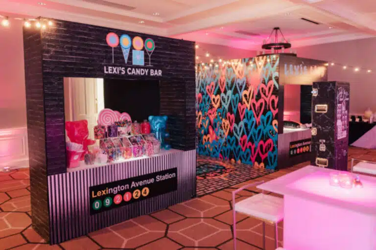
Brands arrive with a guideline document: primary colors, secondary colors, sometimes a tertiary set, usually expressed as hex and occasionally Pantone. The job is to turn that into an environment that feels unmistakably like the brand without painting every surface in the logo color.
Use a 60/30/10 split
A reliable starting point is one dominant color across roughly 60 percent of the visual field — walls, large drapes, flooring — one secondary color for about 30 percent, and a sharp accent for the last 10 percent. The accent is where you put the brand’s signature color if it is too intense to live on every wall. This is what separates a room that looks designed from one that looks like a paint sample exploded.
Pin down physical color targets
For anything we fabricate, we ask for a Pantone or specific paint code, not just a hex value. Hex is a screen reference; print, vinyl, and paint vendors each interpret it slightly differently. A locked physical target means the bar front, the step-and-repeat, and the entrance archway all read as the same color under the same light.
Mind the neutrals
The colors you do not think about — the floor, the drape behind the stage, the linens — carry more visual weight than most teams expect. A warm-white drape versus a cool-white drape changes how every brand color in front of it reads. Neutrals are a color decision too.


 203-208-8909