Event Fabrication

Designing for Photographability: Set Pieces That Get Shared

July 5, 2026 By Event Fab Team 9 min read

Every event now has a second audience: the phones. Before a single guest walks the floor, someone on the brand team is already asking the real question — what here is going to get photographed, and what gets scrolled past. A beautiful room that no one shares is, in marketing terms, a room that mostly didn’t happen.

Designing for photographability isn’t about making things "pretty." It’s a production discipline: building set pieces that hold up to a vertical camera, read your brand in a two-second glance, and give guests a reason to stop, stand, and post. Get it right and your attendees become your distribution channel. Here’s how we build the moments that actually get shared.

Key Takeaways

  • Design for the vertical 9:16 frame first — that's where 80% of guest shares live.
  • Build at least one full-height "anchor moment" guests can stand inside or in front of.
  • Light the face, not just the wall — a Instagram-ready set piece is a lit set piece.
  • Put the brand where the camera already points, not where the layout diagram wants it.
  • Give guests a reason to stop: height, texture, and a clear one-person standing mark.

Think in Vertical Moments, Not Wide Shots

Event renderings are almost always drawn in landscape — wide, eye-level, architectural. But guests shoot in portrait. When you design for event design for Instagram, you’re designing for a 9:16 frame held at chest height, roughly six to eight feet from the subject. That single constraint changes everything about how a set piece should be built.

A wide backdrop that looks stunning on the floor plan often collapses in a vertical crop — the logo lands out of frame, the interesting detail sits too low, and the whole thing reads as beige. Vertical moments are built tall and narrow on purpose:

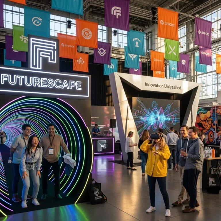
  • Height over width. A structure that runs eight to twelve feet tall fills the vertical frame and dwarfs the guest in a good way. Entrance archways and portals are the clearest example — they frame a person head to toe with brand on every side.
  • A clear standing mark. If guests have to guess where to stand, they won’t. Build in a natural spot — a threshold, a pedestal, a gap in a sculpture — that puts one person exactly where the camera wants them.
  • Foreground and depth. Flat backdrops photograph flat. A set piece with layers — something in front of the guest, something behind — gives the phone camera the depth it loves.

Anchor the Room With One Hero Structure

Guests don’t photograph rooms. They photograph objects. The most shareable events almost always have a single hero structure that the entire floor orients around — the thing people text a friend a picture of before they’ve even taken their coat off.

This is where fabrication earns its keep. A rented backdrop is a backdrop; a purpose-built thematic sculpture or art installation is a landmark. When we build an anchor piece, we’re solving for three things at once: it has to survive a full night of guests touching it, it has to read as your brand from across the room, and it has to look intentional in a photo taken by someone who has never used a real camera. For a deeper look at how these builds come together, our guide to immersive entrance design ideas for events walks through several anchor-moment concepts.

Budget-wise, a genuine hero structure usually lands in the $8,000 to $35,000 band depending on scale, materials, and whether it moves or lights. That sounds steep until you count the shares — one well-built anchor can generate more organic impressions than the rest of the event combined.

Light the Guest, Not Just the Set

The single most common reason a gorgeous set piece produces ugly photos: it was lit for the room, not for the camera. Overhead venue lighting throws shadows straight down — raccoon eyes, no cheekbone, a muddy face against a bright wall. Guests take one look at the result and don’t post it.

A photographable moment is a lit moment. That means:

  • Front fill at face height. Soft light aimed at where the guest stands, not just at the backdrop behind them. Even a modest front source transforms a phone photo.
  • Separation from the background. If the guest and the wall are the same brightness, the photo looks flat. Push a little more light on the person than the set.
  • Color that flatters skin. Deep saturated washes look great empty and terrible on faces. Keep the guest zone in a warmer, more neutral tone and save the drama for the surrounding structure.

This is also why custom LED lettering works so well as a photo element — it’s self-illuminating. The brand message glows on its own, so it reads in a dim room and doesn’t depend on the venue’s house rig to look right.

Put the Brand Where the Camera Already Points

Here’s the trap most teams fall into: the logo goes where the layout diagram has empty space, not where the lens is aimed. The result is a beautiful photo of a guest — with your brand cropped clean out of the frame.

Reverse the logic. Decide first where guests will stand and where the phone will point, then place the brand inside that cone. In practice:

  • Repeat the mark at multiple heights. A step-and-repeat logic still works, but bring it up to shoulder and head height so it survives a tight vertical crop.
  • Make the brand the object, not a sticker on it. Dimensional letters, sculpted logos, and lit type read as part of the scene rather than signage bolted on afterward.
  • Keep it legible small. Your logo will most often be seen as a thumbnail on someone’s feed. If it’s not readable at postage-stamp size, it’s not doing its job.

The goal is simple: a stranger scrolling past a guest’s post should know whose event it was without reading the caption.

Build for Texture, Movement, and the Second Look

A flat printed wall gets one photo. A set piece with texture, depth, or motion gets photographed by the same guest three times — and then by the next group who saw the first post. That multiplier is the whole game.

What earns the second look:

  • Real materials. Foliage, fabric, raw wood, metal, mirror — anything the light can play across. Texture reads even on a compressed phone photo.
  • Kinetic or reactive elements. Something that moves, reflects, or responds to the guest turns a static photo into a video clip, and clips travel further than stills.
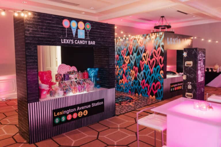
  • Scale surprises. Oversized objects, forced perspective, and things that are bigger than they "should" be reliably stop the scroll.

None of this is decoration for its own sake. Every choice is aimed at one outcome: giving a guest a reason to stop walking, raise a phone, and press share.

A room full of guests photographs the same three objects. Your job is to make sure your brand is one of them.

Event Fab Team

Serving NY, CT, MA & RI

We fabricate and install photographable set pieces for events across New York, Connecticut, Massachusetts, and Rhode Island — from a rooftop activation in Manhattan to a corporate gala in Boston or a brand launch in Providence. Our shop builds to venue specs and load-in realities, so the moment that looks good in the rendering is the same moment that clears the freight elevator and lights up on the floor.

Ready to Build a Moment Worth Sharing?

Tell us about your event and the audience you want reaching for their phones. We'll design and fabricate the anchor moment that gets your brand into every post.
Request a Quote

Designing for Photographability — Frequently Asked Questions

The questions brand and agency teams ask most when planning event set pieces that are built to be shared.
Contact Us

Tell Us About Your Project Or Event